Saturday, March 26, 2011

Using samsung android phone with windows xp

I have a Samsung galaxy 551. I tried connecting it to the pc. I am supposed to install the driver for it. The installation cd had keis on it. Anyway I tried installing it. It should one or two errors, but completed installing,
  When I ran this Keis, it is not showing my phone even though I have connected the phone using usb.  Nor am I seeing it in "my computers". I tried tethering usb from the phone. The windows usb wizard would say " New device found" and give installation instruction. But it will finally say installation failed as there is no driver  samsung android. I tried uninstalling and reinstalling keiss 2-3 times.
  Now I remembered one of the errors I got during installation of Keiss was "unable to find samsung usb driver for android.exe or something of that type. So I googled for that file and downloaded it from the site http://fr.gsmlibrary.com/Products+Support/Z3X/Samsung+files/Samsung+Box/SAMSUNG_USB_Driver_for_Mobile_Phones.exe.html
and installed it.
and then as if my magic, the keiss start showing the dialog, connecting to the device and windows desktop showed the icon "Found the samsung device..." and then " installation success". So finally my pc was able to detect my phone. Eureka.
Then.... then I went to kitchen to finish my little bit of cooking, when I came back, the phone was asking me to connect to keis. And I could explore all the files of my phone and transfer files to the phone. I copied one of my programs - apk files and then clicked it on the phone. Phone installed the apk file. Double Eureka.!!!!

Thursday, March 24, 2011

Tabs with different background colors

For past 3 days I was trying to have different colors for android tabs instead of normal grey and whitish grey. I got an articles from net android tabs like iphone. Now I am unable to find the article now. Anyways, here is the code

View view = new MyView(this, R.drawable.custombutton, R.drawable.custombutton, "Channels");
       //         channelTabSpec = tabhost.newTabSpec("channels").setIndicator(view)
        .setContent(intent);
 tabhost.addTab(channelTabSpec);
---
----
---

Similarly I created two more tabs Newspapers and Techsites. The class MyView used above is 

private class MyView extends LinearLayout {
          ImageView iv;
          TextView tv;
          public MyView(Context c, int drawable, int drawableselec, String label) {
           super(c);
         
           tv = new TextView(c);
           tv.setText(label);
          
           tv.setGravity(Gravity.CENTER);
           tv.setBackgroundColor(Color.TRANSPARENT);
           tv.setTextColor(Color.WHITE);
           tv.setTextSize(14);
          
           tv.setLayoutParams(new LayoutParams(LayoutParams.FILL_PARENT,
             LayoutParams.WRAP_CONTENT, (float) 1.0));
           setOrientation(LinearLayout.VERTICAL);
           Drawable d = getResources().getDrawable(drawableselec);
           tv.setBackgroundDrawable(d);
          
            addView(tv);
        
          }
         }

I have created a file custombutton.xml in the folder /res/drawable for having different appearances for the normal tab and selected tab. Here is the file

<?xml version="1.0" encoding="utf-8"?>
<selector xmlns:android="http://schemas.android.com/apk/res/android">
    <item android:state_selected="false">
        <shape>
            <gradient android:startColor="@color/darkblue"  android:centerColor="@color/lightblue"
                android:endColor="@color/darkblue" android:angle="270" />
            <stroke android:width="1dp" android:color="@color/lightblue" android:radius="1dp"/>
             <corners android:radius="5dp" />
            <padding android:left="1dp" android:top="20dp"
                android:right="1dp" android:bottom="20dp" />
        </shape>
    </item>
    <item android:state_selected="true">
        <shape>
            <gradient android:endColor="@color/steel_blue"  android:gradientRadius="50"
                android:startColor="@color/blue" android:angle="270" android:type="radial" />
               
            <stroke android:width="1dp" android:color="@color/lightblue" />
            <corners android:radius="5dp" />
            <padding android:left="1dp" android:top="20dp"
                android:right="1dp" android:bottom="20dp" />
        </shape>
    </item>
   

</selector>

First item is for non-selected tab and second for selected. In selected tab we are using radial gradient with start color and end color. In non-selected tab we are using linear gradient with start color, center color and end color and angle as 270. Angle can be 90, 180, and 270. Other values for angle will crash the program. Center color is optional.


You can get more info about custom shapes in this android tutorial http://developer.android.com/guide/topics/resources/drawable-resource.html
At the end, my tabs look like this. Well don't bother about color combination, I know I am not so good in that.


The gradient type can be linear, radial or sweep - linear is default. For selected tab I am using radial gradient. 

Notice one more thing here, I am defining two shapes - one for selected and another for not selected - using selector. If you want to use this for button you can use android:state_pressed and android:state_focused and define different shapes for these.
Look at another example where I am defining different drawable pngs for different states
<?xml version="1.0" encoding="utf-8"?>
 <selector xmlns:android="http://schemas.android.com/apk/res/android">
    <item android:state_pressed="false"
         android:drawable="@drawable/lightbtn" >
        
    </item>
    <item android:state_pressed="true"
        android:drawable="@drawable/darkbtn">
        
    </item> 
    

</selector>

This xml file is stored as mybutton.xml in /res/drawable-hdpi and I use the following line in my layout file
----
----
<Button
    android:layout_height="wrap_content"                 android:layout_width="wrap_content"
    android:id="@+id/okbutton"
    android:layout_gravity="center_horizontal"
    android:layout_marginTop="50dp"
    android:background="@drawable/mybutton">
    </Button>

I have lightbtn.png and darkbtn.png in my /res/drawable-hdpi . Now when I touch the button darkbtn is displayed else lightbtn is displayed

Thursday, March 10, 2011

How to access sqlite table from emulator

You can see the contents of text files by exporting it from emulator, but what about sqlite tables? You can use sqlite3 as explained below.
You need to access the adb shell first.
If you are using Linux system, it is simple enough. Just give the command

    adb shell

But for windows xp system, the path might not be properly set. If that is the case, go to the folder where android sdk is installed

If android sdk is installed in f:\android-sdk-windows, then go there and then goto subdirectory tools in that.
Now give the command

     adb shell

Next you need to go to directory which has your sqlite database. For that you use command
     cd /data/data
     cd com.pkg.pkg1

Here com.pkg.pkg1 must be replaced by your packagename of android project.

     cd databases
     dir

At this point, dir must show you the name of your database file. If your database name is mydb, then to open it using sqlite, give the command

    sqlite3 mydb

Now you can use any sql command like select, insert , update etc.

     .tables
     select * from expenses;

Do not forget to end your sql commands with a semicolon.


Be careful if you give a wrong database name, instead of prompting sqlite just shows empty db.
Here is a list of some other useful commands
.schema table
Gives the create statement for that table so you will come to know the columns of the table

.headers on
Shows your select statement with column name headers.

.quit
Terminate sqlite

.help

To obtain a list of sqlite3 commands you can use


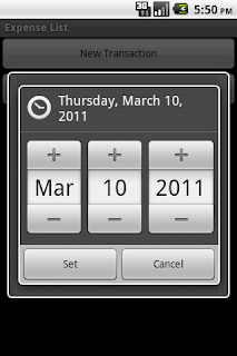
How to use a DatePickerDialog

You do not have a direct widget for date entry. You should use an edittext and enter the date in yyyy-mm-dd format. Instead you can use a datepicker dialog. This dialog can be displayed when user types on the editText which should store the date

If your edit text is etDialogDate,

etDialogDate.setOnClickListener(new OnClickListener() {
          
            @Override
            public void onClick(View v) {
                String dateText = ((TextView)v).getText().toString();
                int year,month,day;
                String temp[]=dateText.split("-");
                year = Integer.valueOf(temp[0]);
                month = Integer.valueOf(temp[1]);
                day= Integer.valueOf(temp[2]);
                DatePickerDialog dtpkrdlg = new 
                     DatePickerDialog(ExpenseList.this, 0, 
                      new  DateSetListener(), year, month-1, day);
                dtpkrdlg.show();
              
            }});

Now this will show the datepicker dialog with initial value as date shown in edittext.

Once the date is set in the dialog it will call the callback function using DateSetListener. Let us define this DateSetListener class as follows

class DateSetListener implements DatePickerDialog.OnDateSetListener{

        @Override
        public void onDateSet(DatePicker view, 
                              int year, int monthOfYear,
                               int dayOfMonth) {
           
             etDialogDate.setText(""+year+"-"+
               (monthOfYear+1)+"-"+dayOfMonth);
           
        }
       
    }

Now any date set in the dialog is displayed back in our edittext widget.

Observe that we have used monthOfYear+1 because in Android Jan is 0 not 1.